Tools:
Procreate, Illustrator, Photoshop
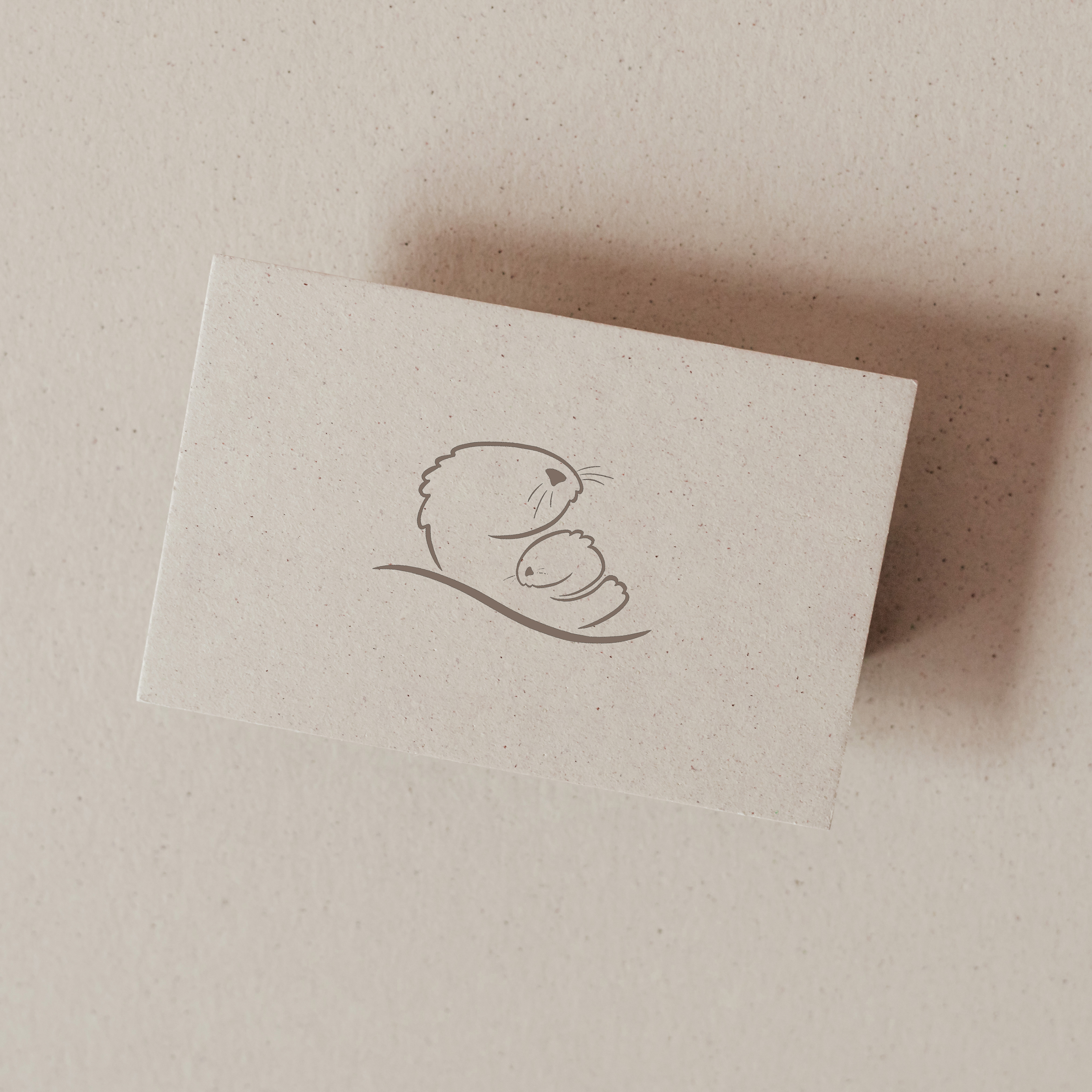
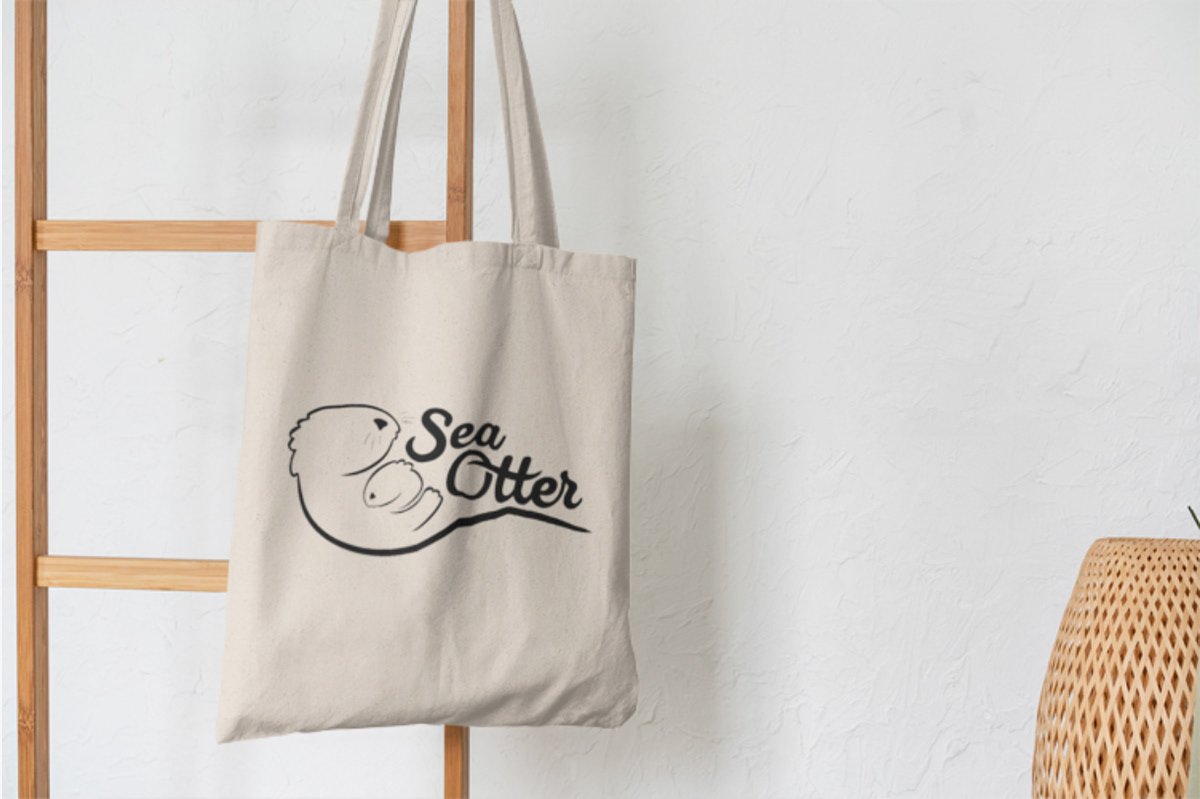
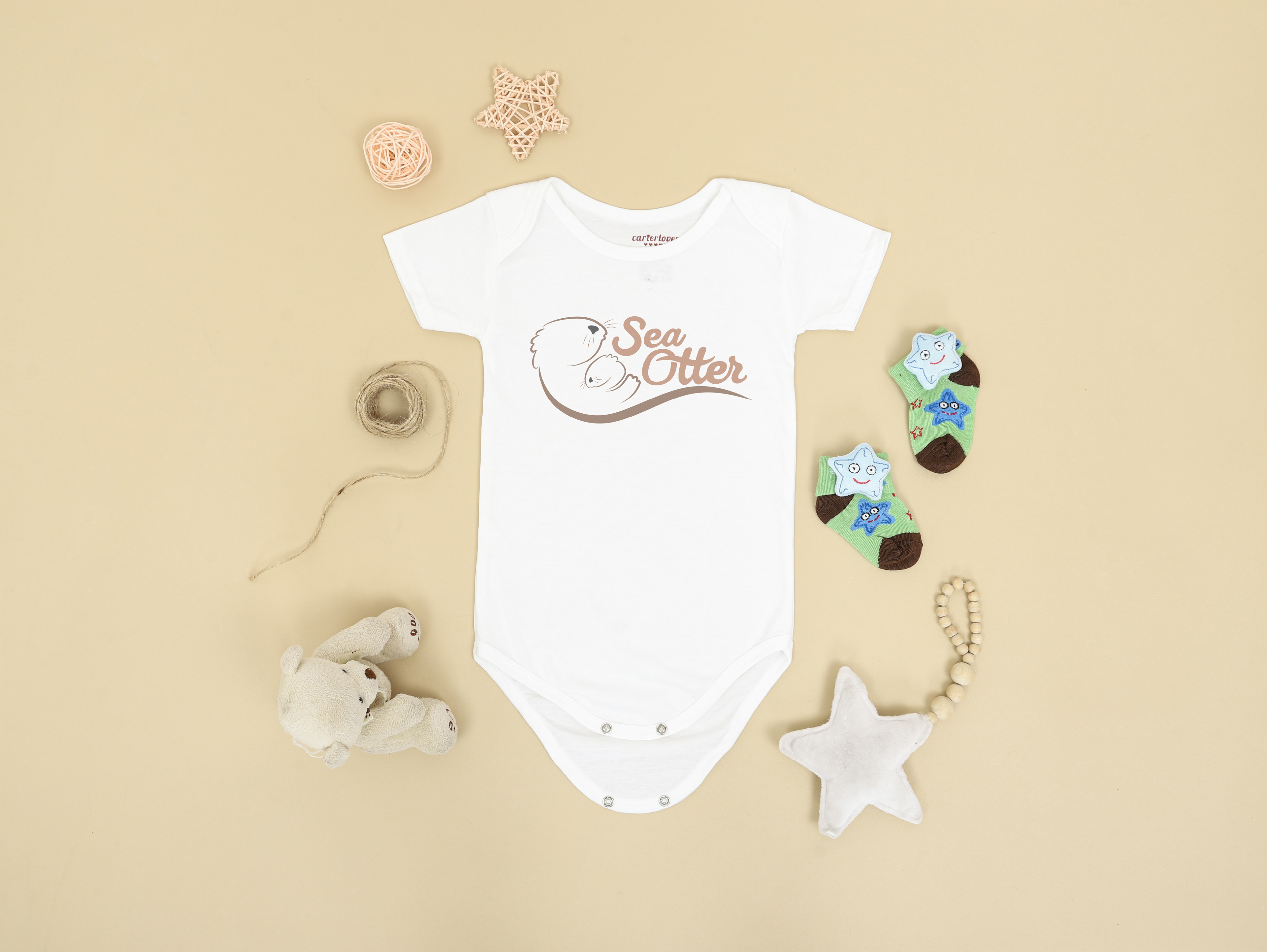
This project challenged me to combine the name and the imagery of a chosen animal to create a logotype for a brand. I chose a sea otter to represent a children's product line due to the strong relationship a mother otter has with holding onto and protecting its baby. In developing my design I stayed with very soft, loose strokes throughout and pastel colors to convey a calming and safe product meant for families.

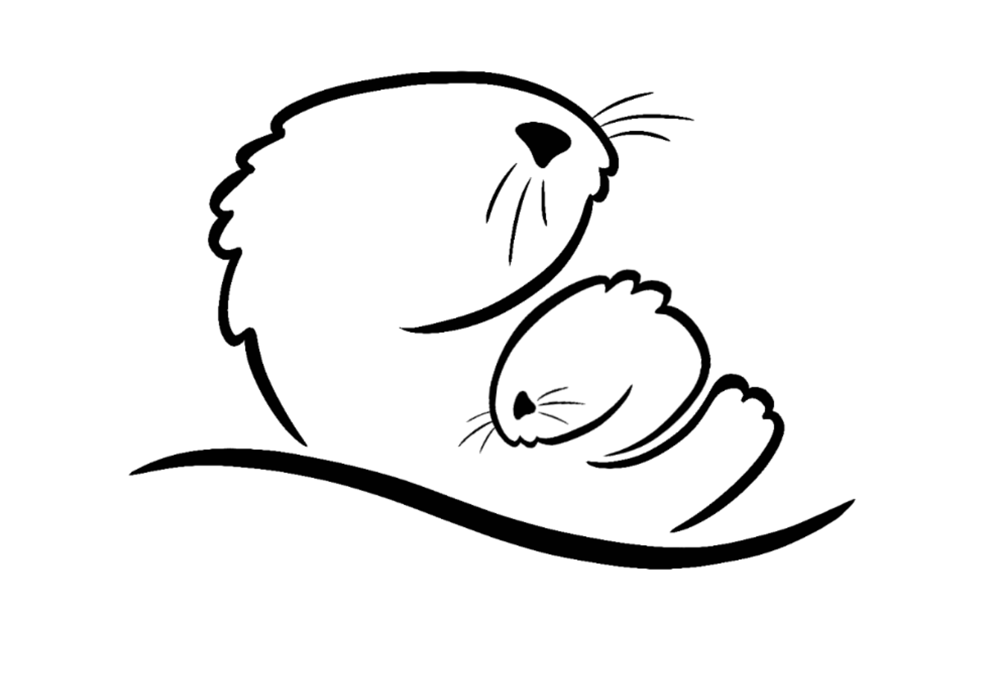
Starting off in Procreate, I sketched out black and white illustrations of a mother otter holding onto her baby, exploring different angles and poses that would work for my symbol. I slowly started to break down the illustrations into simpler parts until I was left with a clean, soft outline of the heads of the otters.

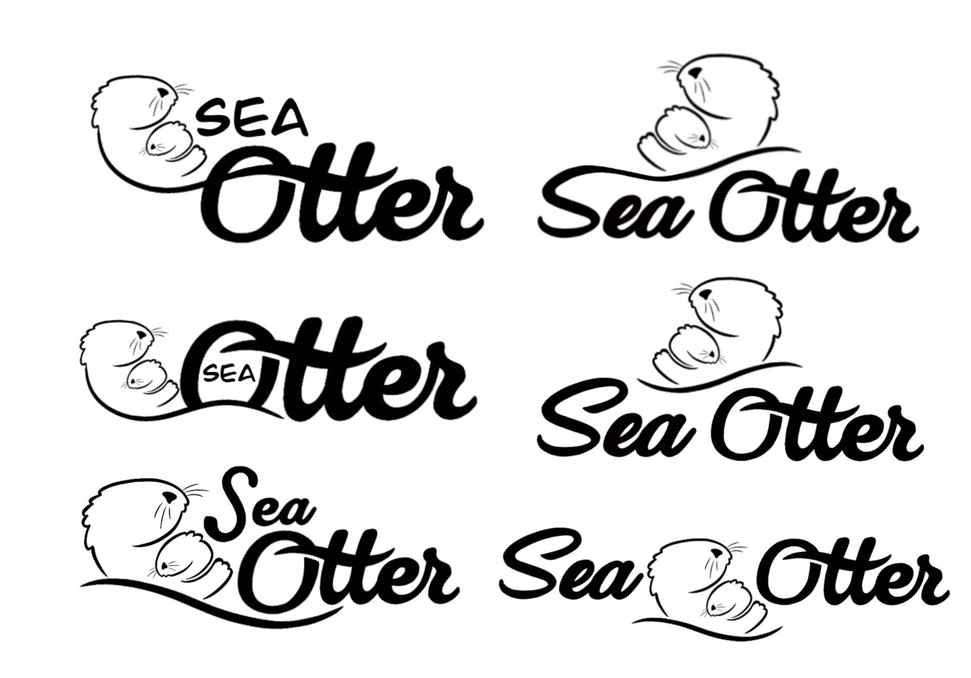
I then moved to illustrator where I experimented with combining my symbols with text to create the word mark and combination mark. Wanting the marks to feel soft and gentle, I chose a very loose cursive font to pair it with.
FINAL SYMBOLS

